Footprynt
Mobile app UI/UX, Naming, Visual identity
Paid work
Year: 2020
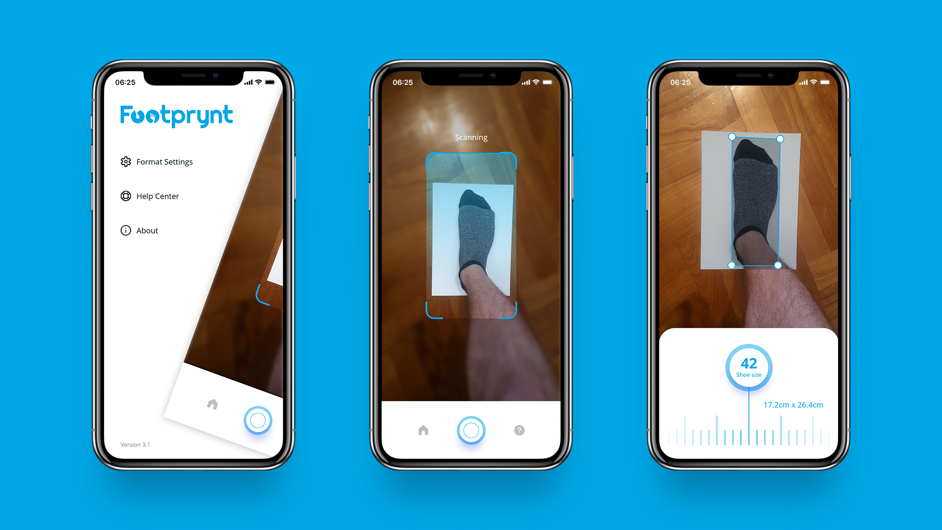
Footprynt is a smartphone app that let’s you tell your shoe size simply by scanning your foot using the regular smartphone camera.

The app needed a simple, associative and yet unique name. I tried playing with words like “scan”, “shoes”, “fit”, etc., but they were all boring and uncreative.
I awakened the poet within me and decided to find a metaphorical meaning, so I came up with the word “footprint” (literal meaning: the impression left by a foot or shoe on the ground or a surface). In the context of the app, the meaning is focused around scanning/printing your foot (and giving its size).
To stand out from the crowd, the only last bit was the stylization – I purposely misspelled the word, so the final result was “Footprynt”.
If you look closely at the word “Footprynt”, you’ll find that your eyes run the most toward the two letters “OO”. The reason for this is the breadth of space that these letters occupy. Therefore, I decided to use this to my advantage by applying a striking detail to just those two letters – I put silhouettes of two feet as an association to footprints in the sand.
Not only does this treatment instantly make the generic word distinctive, it also creates a focused visual icon for use as an app icon, social media avatar, etc.
The icon is responsive – it can optimize the readability at different screen sizes.
Design for a possible brand application.
Applicable to huge sizes like for a company building.
Exoplan
WEB APP UI/UX & CODING, NAMING
Footprynt
MOBILE APP UI/UX, NAMING, VISUAL IDENTITY

KC šetalica
EXHIBITION DESIGN, MOBILE APP UI/UX, NAMING

Sjeverni medvjed
PRODUCT LABEL, NAMING, BRAND IDENTITY
Legends – Legendary October
POSTER DESIGN

SpiceUp
NAMING, BRAND IDENTITY
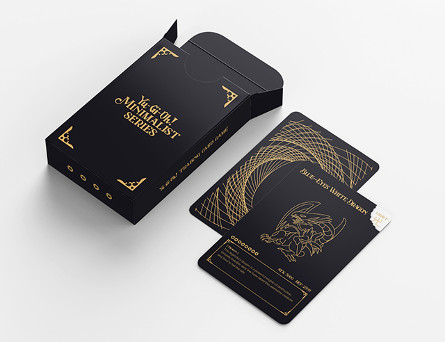
Yu-Gi-Oh!
TRADING CARDS DESIGN (CONCEPT)

Hit Marker
MAGAZINE DESIGN, NAMING, BRAND IDENTITY

Čovjek i prostor
MAGAZINE DESIGN

JOINTS – Labor Day
FLYER DESIGN
trainingset.ai
LOGO, ICONOGRAPHY
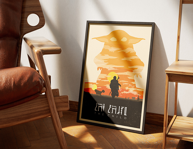
Mandalorian – The Child
POSTER DESIGN